Altora
Home page design for an alpine ski resort: a skier on the summit under one headline
- Клиент
- Altora, alpine ski resort
- Что мы сделали
- Site designArt direction
Project
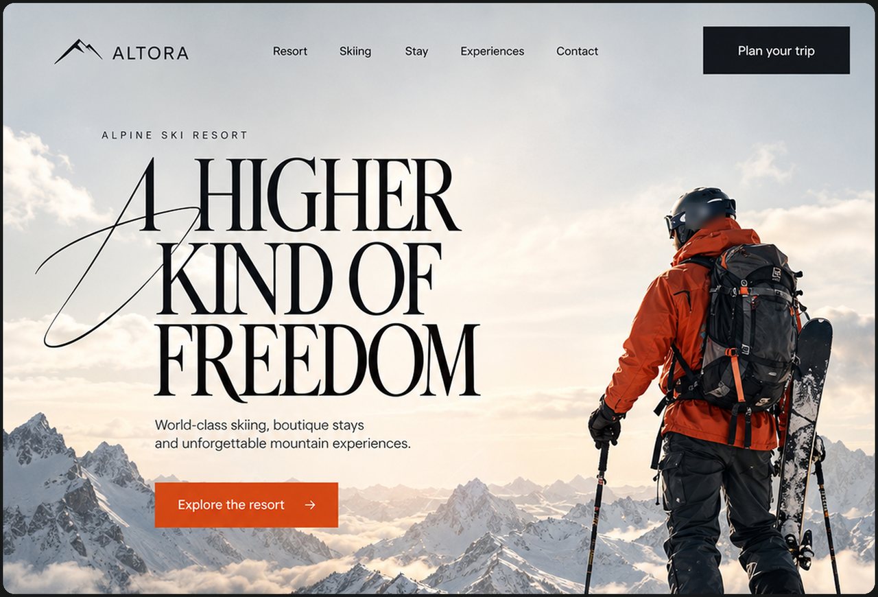
A home page design for Altora, an alpine ski resort. A skier on the summit opens the page.
Task
Ski resorts are compared by lists of lifts, beds and passes. A guest decides by how the mountain feels, and the list does not show it.
The page had to carry that feeling and still lead to the decisions that fill a stay.
Solution
The first screen is a skier on the summit under one headline, A higher kind of freedom, with a clear first action.
Below, three blocks lead to the main decisions: equipment, boutique stays and iconic routes on a map.
What was hard
A strong photo and a tall serif headline can fight for the same space.
An orange accent can spread across the page and flatten the mountain.
How we solved it
The headline is set in a tall serif that echoes the peaks and sits in the sky area of the picture.
Orange is used only for buttons, so it always means an action.
Чем это поможет вашему бизнесу
A skier chooses the mountain first and the details after
A skier on the summit opens the page under one headline, A higher kind of freedom, so the mountain makes the first promise.
Three blocks lead to equipment, boutique stays and iconic routes on a map, the three decisions a guest takes before a trip.
Подойдёт, если You sell a destination: ski resorts, mountain hotels, outdoor clubs, tour operators.