Logo case · E-bikes · Express, one day
A bike steered
by a T.
The name
Torque is the part you feel.
torque /tɔːrk/ · from Latin torquēre, to twist
Anyone can ride a flat road. A bike earns its place on the hill at the end of the street, when the motor adds its share and the pedals stay light. That push is torque, measured in newton metres.
The brand takes the word whole: four letters, hard consonants, no suffix. It reads the same in Paris, Berlin and Tokyo, and it fits on a down tube without shrinking.
Peak torque of the TORQ mid-drive motor, the number the mark is built to carry.
Why this mark
The handlebar is already a T.
Look at a bike from the side. The handlebar is the bar of a T and the stem is its stem, standing right over the front wheel. Nothing needs inventing: we drew the whole bike in six strokes and made that one part red.
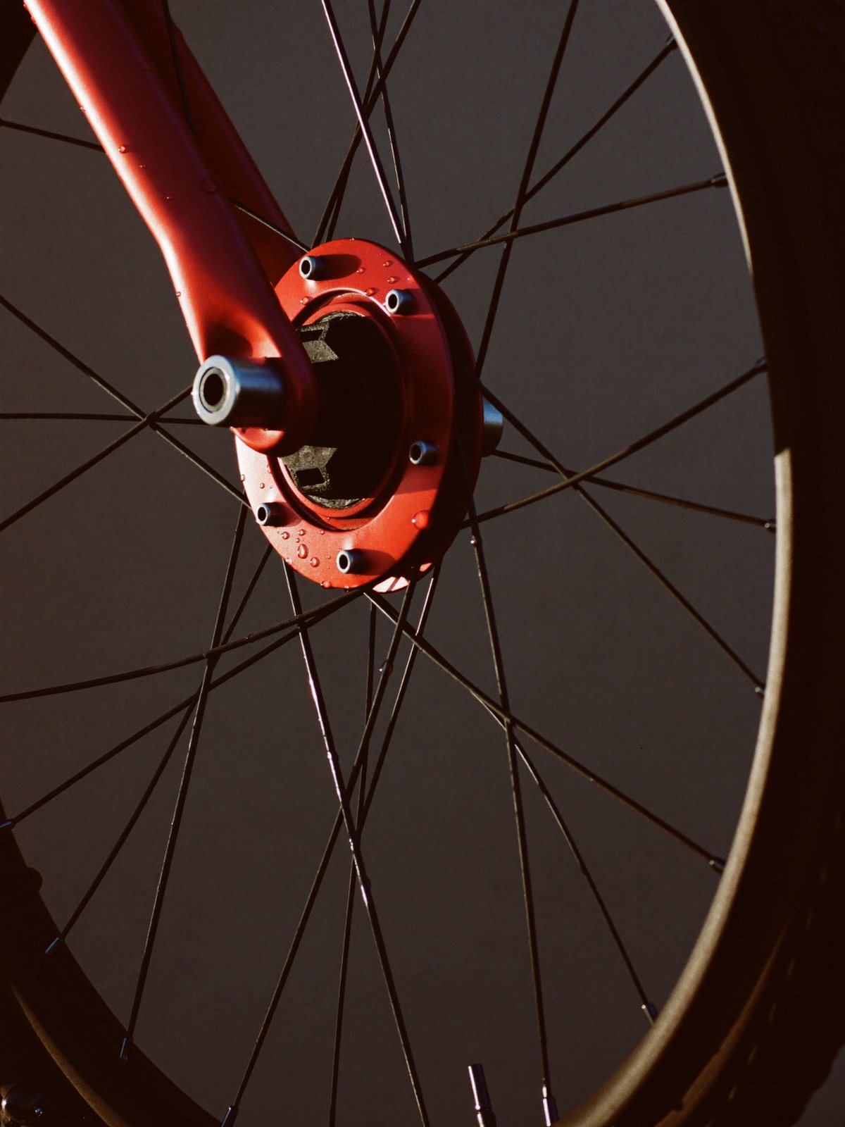
The red T points at the red hub, which is the motor. So the one red thing on the bike is also the place the torque comes from: you steer with the T and it pushes from the hub.
Round one
Six directions. None had a bike.
The first round went on what a torque brand usually looks like. The last one was our own first answer, and it is the one we liked most.
Nut and T
Reads as a hardware aisle. Any brand with a bolt could wear it.T and bolt
Every e-bike already has a lightning bolt. Nobody remembers it.Coil
Pretty on a poster. Gone at 40 px.Chain links
Too busy for a head-tube badge.Speed lines
Says fast. The product is about pull, not speed.Circle and T
Tidy and small-size proof, but nobody could tell it was a bike. That was the whole point of the job.Construction
Built on one wheel.
Every measure comes from the wheel. The T is as wide as four fifths of a wheel and as tall as one, and the hub sits dead on the wheel’s centre. Nothing is nudged by eye.
- ØWheel diameter, the master unit (94)1.000 Ø
- AWheelbase, hub to hub1.872 Ø
- BT bar, width0.809 Ø
- CSteering height, bar to hub1.037 Ø
- ·Stroke, everywhere0.149 Ø
- ·Motor hub, diameter0.362 Ø
One stroke weight for wheels, frame and T, so the bike reads as one drawing. The stem leans forward by the same angle as a real fork, which is also what gives the mark its motion.
Type and kerning
Gaps tuned by eye.
The wordmark is drawn, not typed. Round letters need less space than straight ones to look even, so the gaps between T, O, R and Q are all different. The two red bars below carry the motion: the long one is the ride, the short one is the assist.
Gaps are shown in cap heights (172.5 units). Red lines mark where round letters overshoot the flat cap height and baseline by 4 units, so O and Q do not look smaller than T and R.
In the world
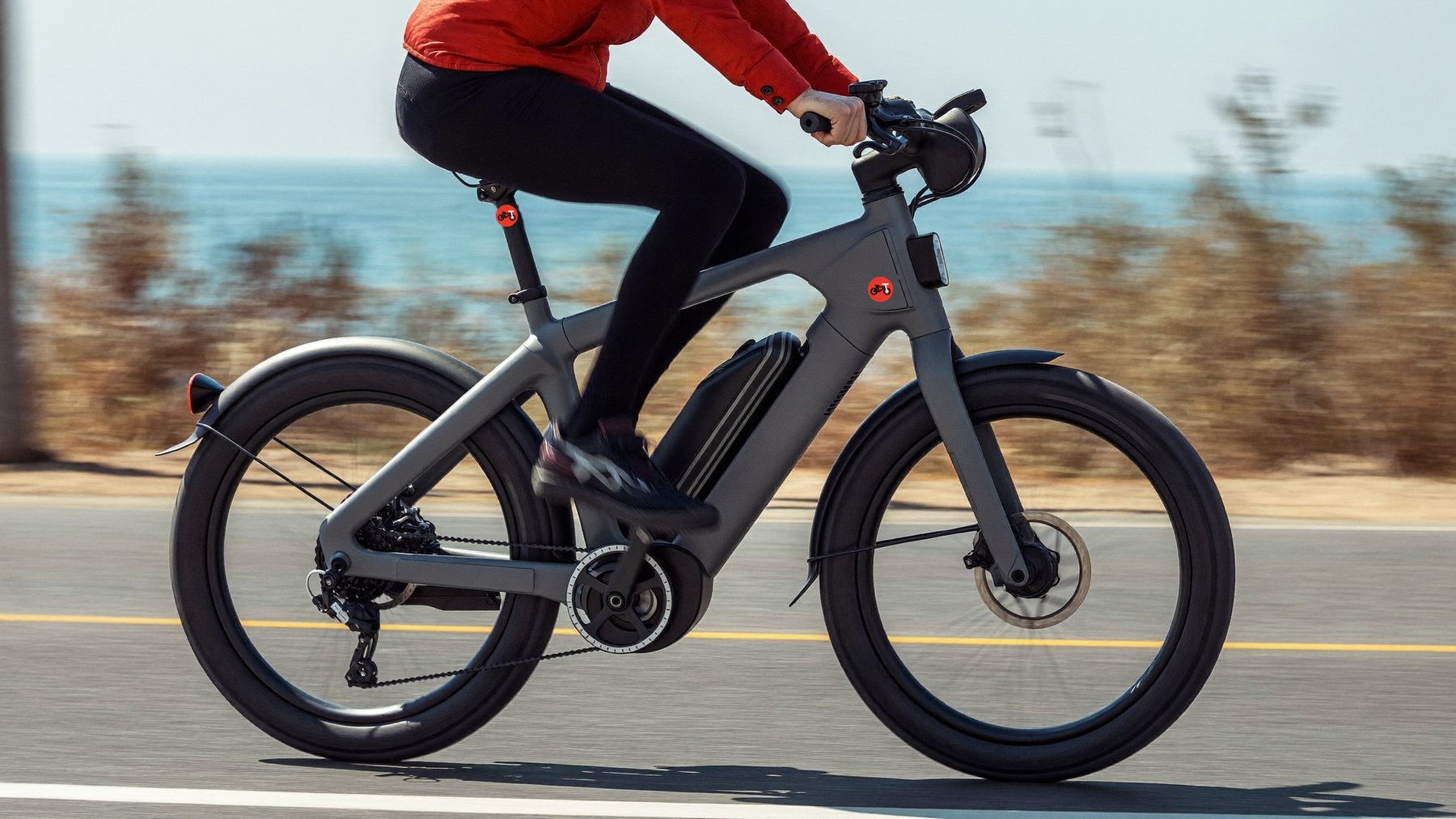
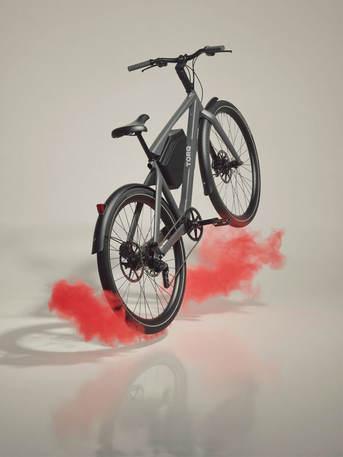
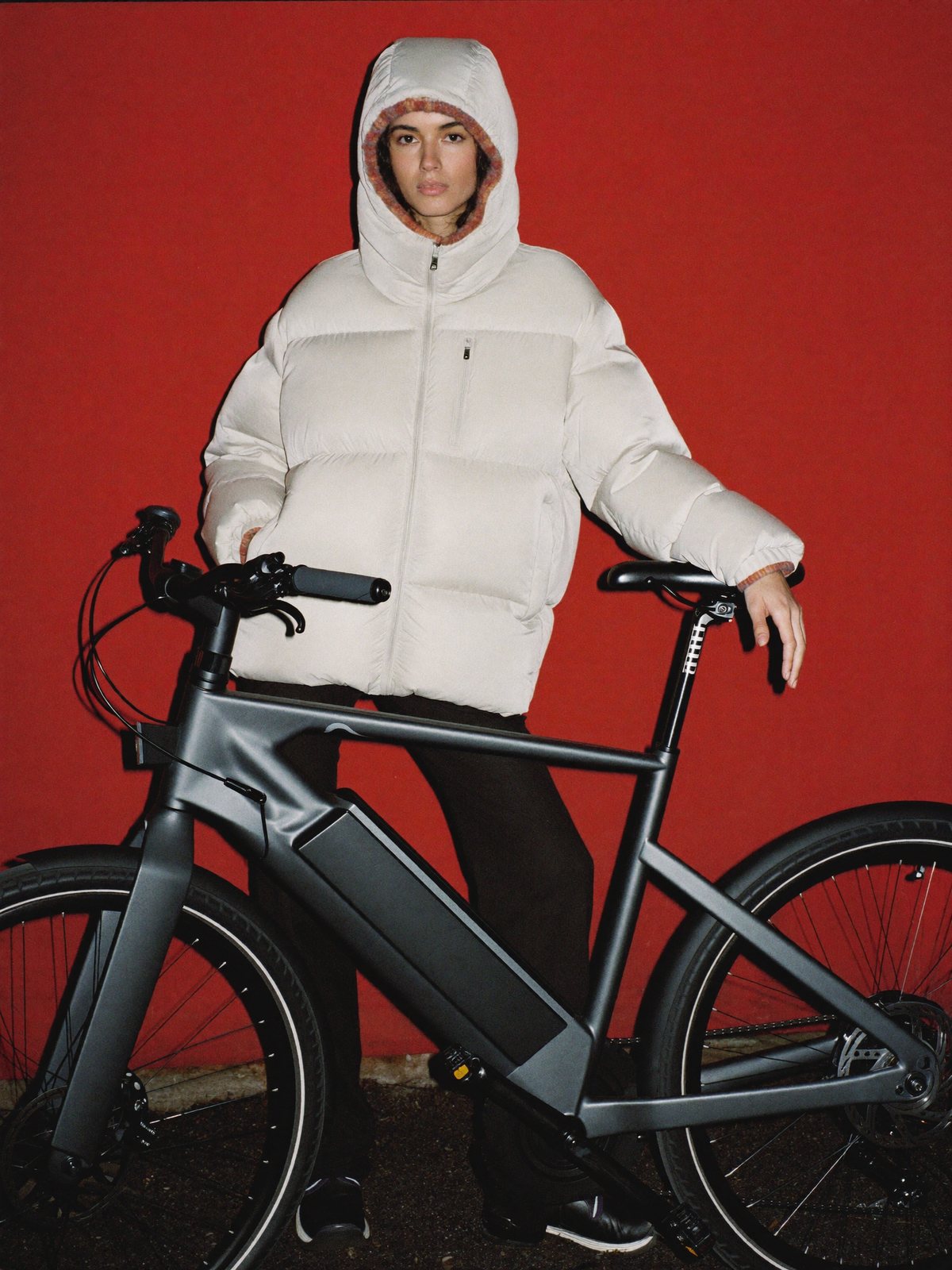
Pull the road sideways.
Four frames, one mark. The torque figure climbs as you go: the further the road, the harder the motor works.
The kit
Printed, not stuck on.
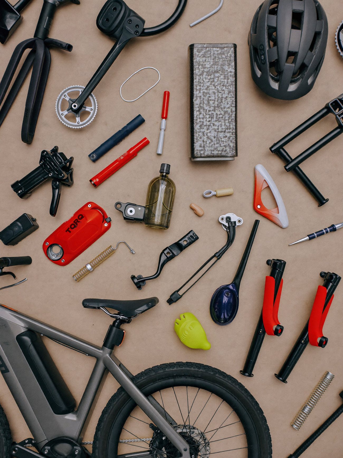
On the red battery lid the wordmark is a graphite print, one colour, set on the part like a stamp. Smaller parts would carry the coin alone.
Red is spent on parts you touch: lid, grips, tool handles.
Clear space and minimum size
Room to breathe.
One wheel radius, 0.5 of the wheel diameter, on every side of the lockup. Nothing enters it: no text, no photo edge, no button.
Lockup: 110 px wide on screen, 28 mm in print. Below that, drop the red bars.
Bike alone: 48 px wide at the least. Below that, switch to the coin, down to 24 px: the size of a favicon and a head-tube badge.
Versions
Never
A little technique
The numbers behind it.
Colour
on milk: 16.2 : 1
on graphite: 16.2 : 1
graphite on red: 5.2 : 1
Motion
- Mark
- Wheels, frame and saddle draw on in 0.7 s, then the red T drops in and the hub pops, 0.4 s.
- Letters
- Slide in from the right one by one, 0.09 s apart.
- Bars
- Wipe out from the left at 1.35 s and 1.5 s.
Files
- Vector
- SVG, transparent and on brand ground
- Raster
- PNG, transparent, 2x
- Motion
- HTML animation and MP4, 2 s
- Grid
- Construction sheet with all measures
Express logo
Your mark by tomorrow.
- Mark and wordmark, drawn on a grid
- Four colourways and an icon
- Short logo animation
- Clear space, minimum size, don'ts